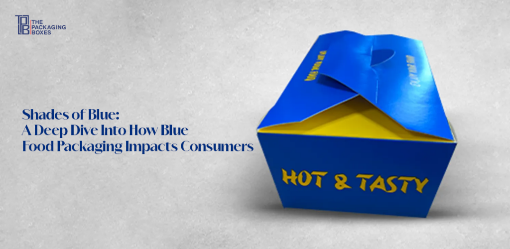
Packaging
Blue Food Packaging Designs & Wrapped Foods Ideas UK
Are you looking for blue food packaging for your brand? With The Packaging Boxes’ modern printing technologies, we’ll satisfy all your packaging needs! TPB is the perfect one-stop solution for all your boxing needs. We manufacture packaging solutions for retail, e-commerce, events, etc, ensuring your brand’s needs are met! Invest in our custom packaging solutions to save a ton of money while getting the premium quality you desire! We keep our quality high and our prices low, always putting the customer first. So, what’s the holdup? Invest in our bespoke packaging today, and start your journey with the leading packaging supplier in the UK!
Introduction: When it comes to packaging, the colours you use are immensely significant. These colours are the first thing anyone notices about your packaging, so you must ensure your chosen colours are eye-catching. Now, if you’ve made it this far, you obviously read the title. You must be wondering why we’re talking about blue food packaging specifically, but don’t worry, we’ll get to that soon! First, it’s essential to understand why colour schemes are so significant for your packaging.
The Psychology of Colour in Food Packaging
Psychology studies have found that specific colors work better to represent different emotions and traits. For example, green is seen as healthy, and yellow is seen as high energy. These colour choices are critical when deciding the colour schemes for your custom printed food boxes. Putting some thought into your decision will significantly impact your consumer base. You will attract more customers and provide your consumers with a better quality product.
As psychology studies have found, human reaction to colors and hues is involuntary. Different colours affect people and influence how they react to your packaging visuals. Let’s discuss how the colour blue will affect your custom food boxes and how you should apply them.
Why Choose Blue Food Packaging For Your Brand?
Before we get into the food packaging side of things, let’s understand what the colour blue represents. Blue is often a show of tranquility and peace. It has a calming presence, keeping people at ease. The most common association with blue is the sky, a known symbol of beauty and tranquility. Blue relates to trust, honesty, reliability, and unity. All these characteristics can play a pivotal role in trying to gain your consumers’ trust.
Now, let’s talk about blue food packaging. Living in the UK, we already know you love a fresh bag of fish and chips. Going down to your local chippy and grabbing a bag of fresh fish and chips is one of the best feelings for a Brit. Now imagine you go down to the shop after a long day at work. You order a bag of fish and chips, and it gets to your table in a brown bag. Not the most appealing sight, is it?
Now think of the same scenario, but with a blue bag instead. For your food packaging, the colour can make all the difference. Using the colour blue for your brand is a brilliant idea because of the calming feelings it invokes. The colour also reminds consumers of the sea, which is quite fitting given our hypothetical scenario. Blue food packaging for your fish and chips offers an iconic look that every Brit will be familiar with. At the end of the day, blue is an essential part of every Englishman’s identity. So, why not help your consumers feel more at home?
Brands Using Blue Food Packaging
Let’s take a look at some popular food brands that are already using blue food packaging to great success.
Chips Ahoy
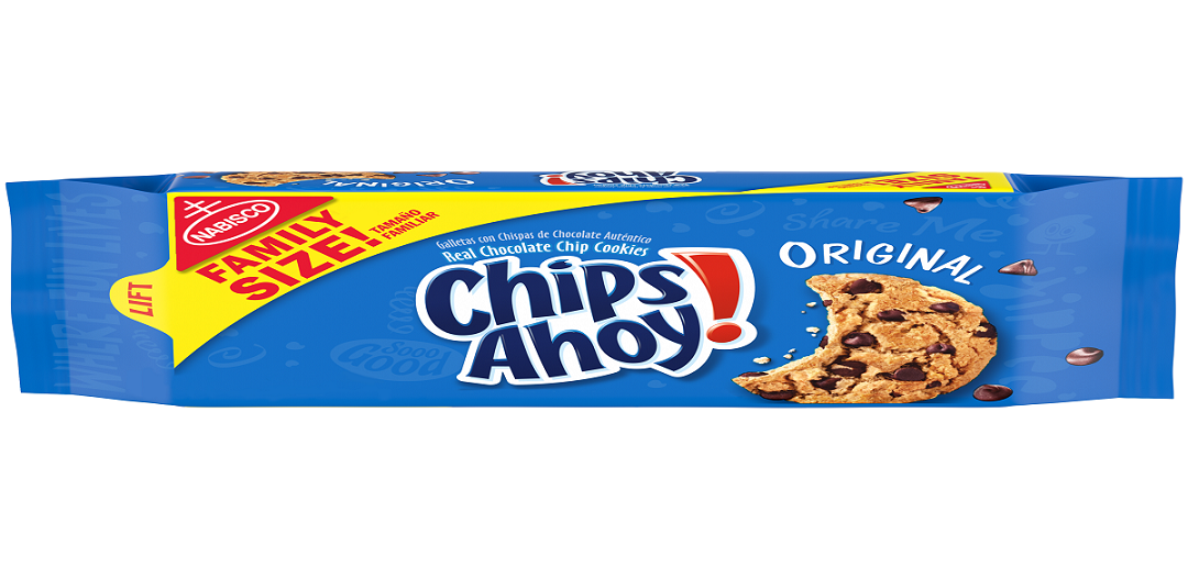
One of the world’s favourite chocolate chip cookie brands, Chips Ahoy, is known globally for its instantly recognizable blue packaging. You could spot a pack of their tasty cookies from a mile away, and it’s all because of their iconic color scheme.
Oreo
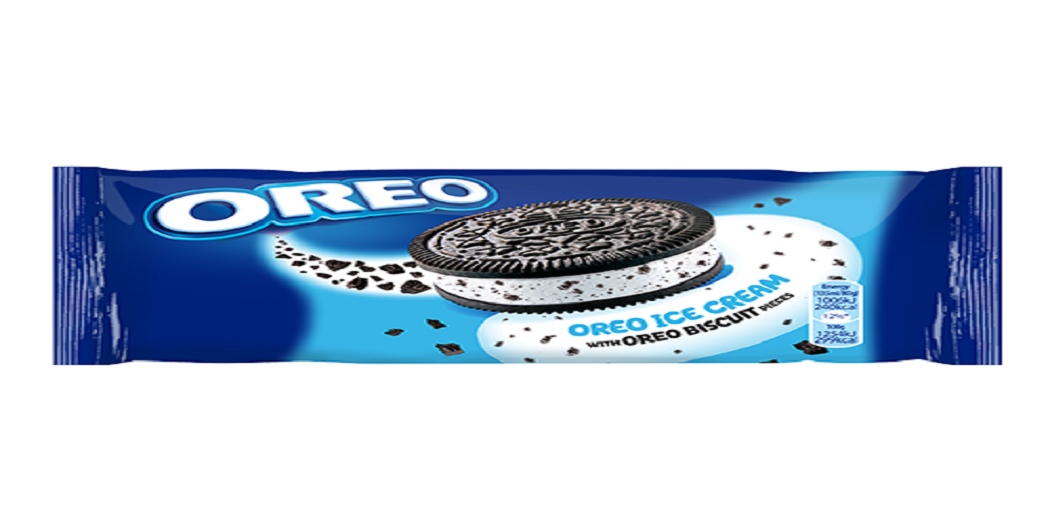
Another major player in the cookie industry, Oreo, is undoubtedly the King of the market. Yet again, as soon as we think of Oreos, we immediately think of blue.
Doritos
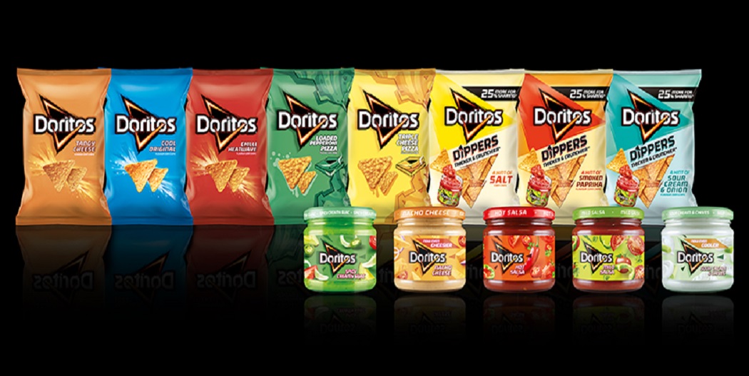
Doritos is another big-name brand that uses blue. However, this time, it’s not just for the brand, but for a specific flavour. Doritos, as well as several other crisps brands, use the colour blue for specific flavours. Cool ranch is a popular flavour that is often represented by the colour blue.
Walkers Blue Food Packaging
The UK’s all-time best-selling crisps are Walkers’ cheese and onion. Loved across the country, Walkers’ cheese and onion are iconic in the UK, and guess what colour their packaging is. Yep, you guessed it, it’s blue! There’s a reason we didn’t mention Walkers with the rest of the brands above because this example holds more importance. People have always been confused as to why a flavour called cheese and onion is represented by blue food packaging. Lucky for us, Walkers actually answered the question!
Addressing the packaging theories on its own website, Walkers writes: “Our Salt & Vinegar and Cheese & Onion flavour crisps packs have always been the colours they are today.
“Contrary to popular belief, we’ve never swapped the colours around, not even temporarily. We’ve no plans to change these designs, as they’re signature to our brand.”
Apparently, though, the blue packet is believed to be a nod to the brand’s regional roots.
In 2014, a YouGov survey found that the public wanted the packaging to be changed from blue to green (44 percent voted green, 30 percent blue). However, this wasn’t the case in the Midlands.
Based on the YouGov survey, the Midlands was the only region to vote in favour of Walkers keeping the colour of the cheese and onion crisp packet blue, with YouGov hypothesising: “This is likely because Walkers is a Midlands company, founded in Leicester in 1948, and was still primarily a regional brand as late as the 1980s.”
What’s more, younger generations are similarly outliers who seemingly back the brand’s choice of blue packaging, with 54% of young people supporting the current packaging.
Basically, it looks like the blue food packaging is here to stay, and we can’t imagine it being any other way.
Conclusion
At the end of the day, blue food packaging might not be the most popular choice for food packaging; however, it definitely has a purpose. If you can use it well, creating a colour scheme that revolves around blue is incredibly beneficial for your brand. The colour represents tranquility, peace, and calm. We don’t know about you, but we think those are some fantastic traits to associate with your food.
FAQs
Why Is Blue A Good Colour For Packaging?
Blue relates to trust, honesty, reliability, and unity. All these characteristics can play a pivotal role in trying to gain your consumers’ trust.
Why Is Colour Important In Product Packaging?
Your packaging’s colours are the first thing any consumer will notice about your product. You must ensure your packaging’s colour scheme is eye-catching and memorable enough to leave a long-lasting impression.
Why Do People Choose Colours Based On Products?
An essential part of product packaging is to create associations with visuals. When you create a strong brand identity, your colours will be associated with your products and vice versa.
Why Is Blue In Food So Important?
Blue serves an essential role in food packaging as it creates a sense of reliability and helps your brand gain trust from consumers.

